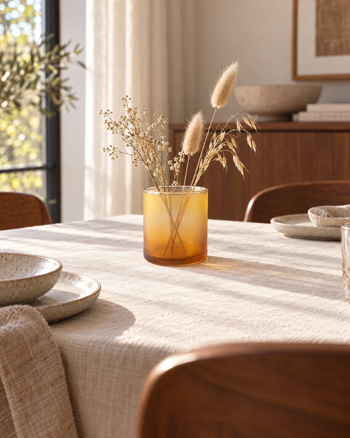
Honey Haze Amber-to-Honey Gradient Wide Cylinder Decorative Vase with a Soft Translucent Look for Warm Modern Interiors
Honey Haze Amber-to-Honey Gradient Wide Cylinder Decorative Vase with a Soft Translucent Look for Warm Modern Interiors
Couldn't load pickup availability

🍯 Color That Feels Like a Slower Afternoon
Honey Haze takes a different approach to a colorful accent. Instead of sharp stripes or contrasting patches, it uses a gradual transition from honey yellow near the top to deeper amber toward the base. The simple cylindrical outline gives that change in color room to become the main detail. A wide circular mouth, a fine clear-looking lip, and a more defined lower edge complete the visual composition.
The concept has a softly frosted, translucent appearance. In the imagery, the surface looks hazy rather than sharply transparent, with a warm tone that becomes richer lower down. This is a visual design direction, not confirmation of a particular material or manufacturing process. The appeal lies in the combination of a restrained form and a color transition that feels more atmospheric than graphic.
🌤️ A Visual Study in Three Layers
At the Top: A Lighter Honey Tone
The upper section carries the palest part of the gradient. Its yellow tone gives the body brightness without an illustrated pattern or separate decorative band. Against lavender, pale blue, or a warm neutral backdrop, this area becomes a gentle point of contrast. The opening remains broad and uncomplicated, continuing the straight-sided form rather than narrowing into a neck.
Through the Middle: A Gradual Change, Not a Hard Boundary
The color deepens through the body without the deliberate dividing lines of a color-block design. That gradual change is central to the concept. The eye moves from lighter to richer tones across a continuous surface, while the cylindrical outline stays consistent. Nearby accessories can introduce a clearer edge or pattern if you want more contrast in the arrangement.
At the Base: A Deeper Amber Finish
The lower area gives the palette more depth. A darker amber tone and a clear-looking base edge define the end of the body in the concept image. Visually, this provides a stronger lower boundary beneath the softer upper color. It can connect naturally with warm wood, ochre artwork, or a terracotta-colored textile in the surrounding room.
🟡 What Makes the Shape Feel So Clear?
The body has straight cylindrical walls, a flat-looking base, and a wide circular opening. There are no handles, projecting shoulders, or elongated neck. That simplicity keeps attention on the gradient and the soft surface appearance rather than a complicated outline.
From the front, the body reads as a clean upright form with rounded sides. From slightly above, the circular mouth and fine lip become more noticeable. The wider opening gives a different visual character from a narrow-necked vase, even when displayed empty. Confirm actual manufactured dimensions before deciding how it will relate to the objects around it.
- Visual palette: light honey yellow transitioning toward deeper amber.
- Outline: broad straight-sided cylinder without handles or a projecting neck.
- Upper detail: wide circular mouth with a fine clear-looking lip.
- Surface direction: softly frosted and translucent-looking in the concept imagery.
- Lower detail: a more defined amber area and visible base edge.
🪔 Build a Mood Around the Color, Not a Theme
For a light, airy arrangement: begin with cream and pale wood. Let the amber gradient become the warm accent rather than surrounding it with equally strong yellows. A simple book or a quiet print provides a companion without competing for attention.
For a richer setting: introduce walnut, warm ivory, and a small amount of terracotta. The deeper lower color of the vase can connect with those tones while the lighter upper area keeps the overall palette from feeling uniformly dark.
For a cooler contrast: choose pale lavender, soft blue, or muted sage nearby. The warm gradient then has a different backdrop to stand against. You do not need to add several cool colors at once. One deliberate contrast is enough to change the mood.
🧺 Three Styling Chapters for Everyday Rooms
Chapter One: A Living Room With Less Visual Noise
Try Honey Haze on a light oak side table near cream upholstery. Pair it with a low book or another simple object rather than a cluster of small accessories. A muted lavender cushion elsewhere in the room can provide a cooler counterpoint to the warm color.
The clean cylinder works well where you want color but not another motif. If the room already contains patterned textiles or expressive artwork, an empty display can feel complete. Let the gradient provide the variation while the surrounding pieces retain their own character.
Chapter Two: A Sideboard That Feels Warm Without Feeling Heavy
On walnut, the lighter honey tones create contrast with the darker surface. Folded cream linen can repeat the quieter part of the palette, and a restrained ochre print can connect with the warmer color. A pale blue accent nearby introduces a different temperature without changing the entire room.
If you add dried or artificial stems, keep the arrangement light enough that the wide mouth and upper lip remain visible. Their irregular lines can contrast with the straight walls, but the body should still read as part of the display rather than simply a container beneath the stems.
Chapter Three: A Bedroom or Workspace With a Softer Accent
Against a pale lavender wall, the gradient can become a warm note within an otherwise quiet bedroom. Place the vase on a dresser beside a low book and a simple oval mirror. Cream bedding and a small terracotta accent provide connections without requiring exact matches.
For a workspace, use a muted sage backdrop and a small selection of books. The cylinder introduces a broad rounded outline among rectangular objects, while the amber tone breaks up a predominantly neutral shelf. Leave enough space around it that the color transition remains easy to see.
🌻 An Ordinary Corner, Reconsidered
Imagine a side table that has become a place for several unrelated objects. Clear the surface, keep the book you still want nearby, and place Honey Haze beside it. Choose a viewing position where both the body and circular opening are visible. Then step back before adding anything else.
The difference comes from giving the arrangement fewer competing ideas. The book creates a horizontal form, the vase adds a cylinder, and the gradient supplies warmth. You can keep the display simple or introduce one supporting color through a textile elsewhere in the room. Neither choice requires a complete makeover.
Later, move the book or change the nearby print rather than replacing the whole composition. A cooler companion makes the amber appear more contrasting; a warm neutral creates a softer relationship. The same visual concept can support more than one mood.
🪷 Empty or Botanical: Two Different Emphases
An empty display keeps attention on the circular mouth, straight walls, and gradual change in color. It is the more restrained option, particularly beside artwork or patterned fabrics. The opening is part of the design and does not need to be hidden.
A sparse arrangement of dried or artificial stems adds a looser outline above the body. Begin with a small number and leave space between them. Avoid a dense arrangement that conceals the upper section or turns the gradient into a background detail.
Water-holding suitability has not been verified. Do not fill with water unless suitability has been confirmed for the actual product. The botanical styling described here uses dried or artificial stems only.
🫖 A Few Details Worth Keeping Clear
The translucent-looking appearance is part of the concept imagery, not a verified claim about optical performance or actual construction. The vase is not described as a candle holder, drinking vessel, or food container. Those uses have not been established. Choose it as a decorative concept and confirm the manufactured item's specifications before purchase.
Similarly, a wide opening in an image does not establish capacity, stem support, or stability with a particular arrangement. Check actual dimensions and use a stable, level display surface away from edges. Support the body and base when moving it, and follow confirmed material-specific cleaning instructions before soaking or applying products.
📋 What Is Included?
This listing is for one decorative vase. Stems, books, furniture, textiles, mirrors, and other styling accessories are not included.
The images are AI-generated product concept visuals, not verified photographs of a manufactured item. Apparent scale, color, surface appearance, and lighting effects are illustrative. Actual materials, measurements, finish, and functional specifications need to be confirmed before purchase.
🧡 Give Warm Color a Quieter Expression
Honey Haze brings a softer visual rhythm to a colorful home. The cylinder keeps the outline clear, the wide mouth gives the top a simple circular detail, and the honey-to-amber gradient introduces depth without a repeated pattern. It is an accent for a room that wants warmth without another complicated shape.
A simple cylinder. A gradual amber story. A warmer place to pause. Honey Haze, $38.90.